We've worked on such a wide variety of projects for all types of companies that its tough picking just a few projects! From our early days (before GoBig) we were taught the value of strong branding from some truly inspiring mentors ~ located in Manilla, London & San Francisco. From the beginning, we were fortunate to have been given opportunities to work with many internationally known brands, like Arco, Wells Fargo, Anheuser-Busch, JBL, RHP Bearings, Petsmart, British Petroleum, Harmon Kardon and Bank of America.
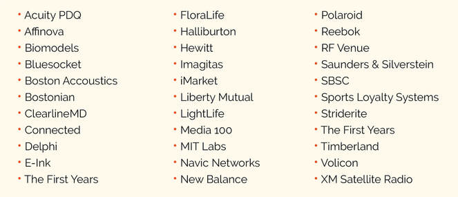
GoBig's clients in the CPG/CE space include:
GoBig's clients in the CPG/CE space include:
Scroll down to see examples of some of the work from our portfolio:
consumer packaging:
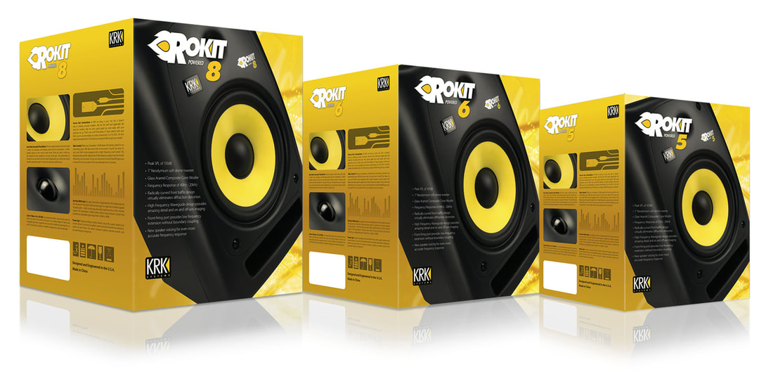
KRK Systems
Grab 'n' go Rokit speakers made some noise on shelf, grabbing the attention of the musician target audience.
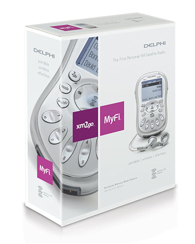
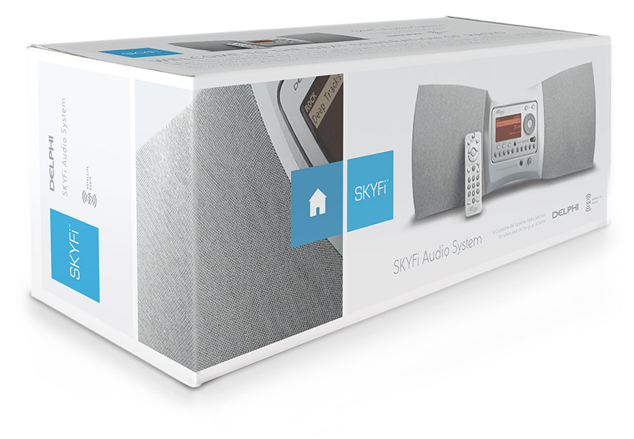
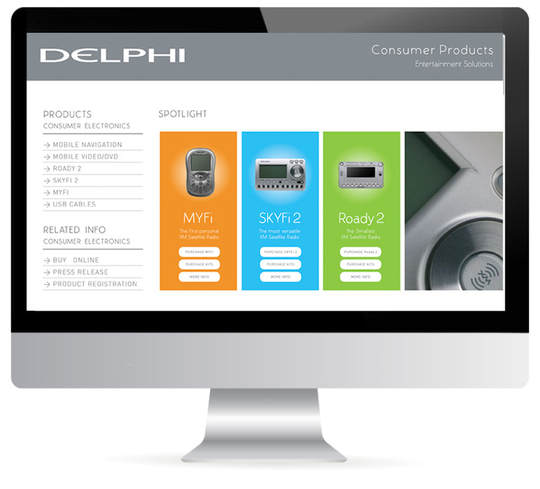
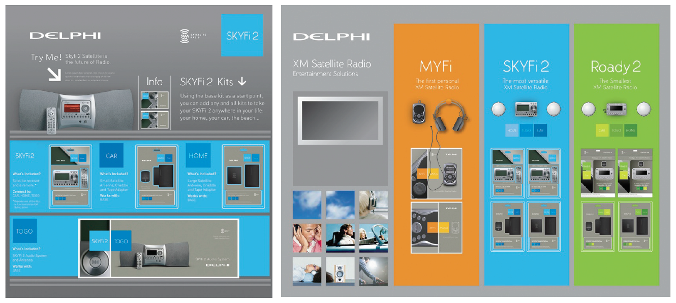
xm/Delphi Satellite Radio
When satellite radio was just becoming a thing, we were asked to develop the packaging architecture and marketing platform that leveraged a new line of products for two brands working together to develop the premier line of satellite products - xm & Delphi. The line required co-branding. The result was a line of clean packages, color coded product lines made it easy to shop and 'accessorize'. The P.O.S displays were developed with live demo's & grab-n-go shopping within Best Buy & other consumer electronic retailers.
brand design
Leveraging all of the experience, we've garnered over the years enables us to take an idea thats as simple as a doodle and bring it to life. Several times we've been involved in every aspect of a brand's development - from the naming of the product or business to the development of the entire brand identity - its packaging/website & sales materials. Here are a couple of examples where we've been involved deeply with the brand development or repositioning...
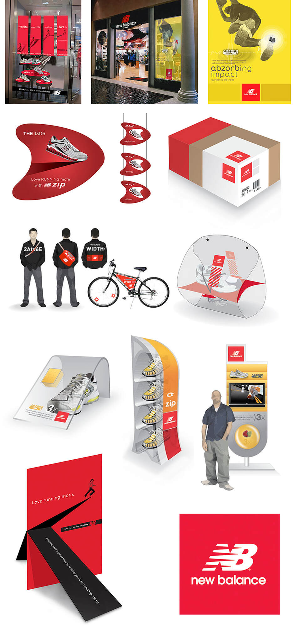
New Balance | complete brand immersion
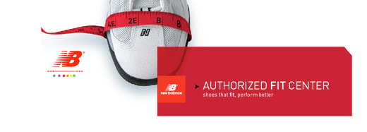
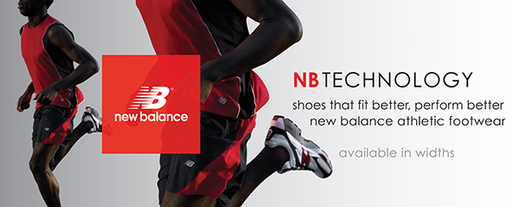
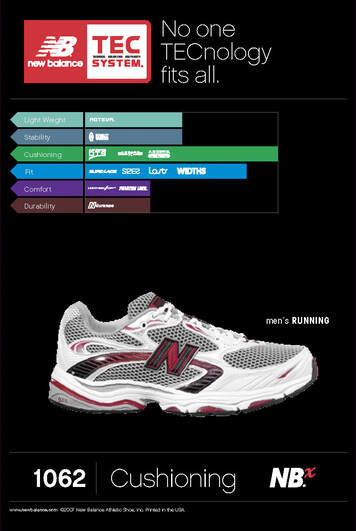
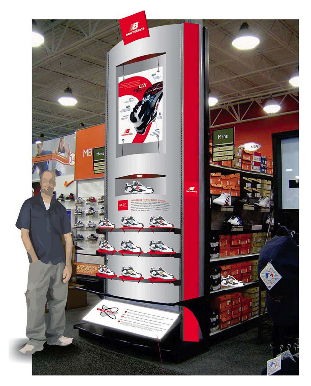
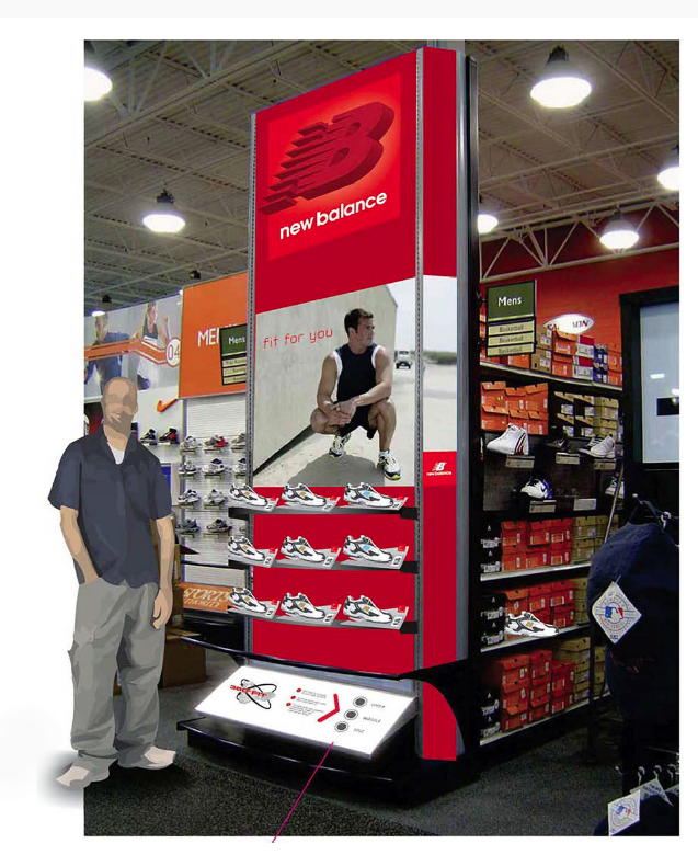
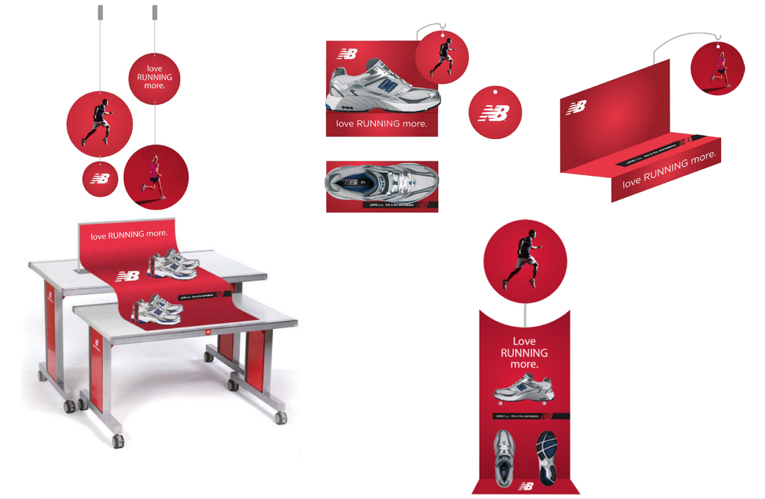
Over a ten year period we were the go-to for the New Balance creative marketing team. We literally produced thousands of graphics for a multitude of very varied projects - new technologies, seasonal promotions, product launches, brand management, new product initiatives, secret internal marketing meetings to traveling expos that doubled as pop-up stores at international marathons. Due to our breadth of experience with the brand, we were ideally positioned to help NB with the rebranding (a simplification of the NB logo) and the development of a global brand guideline which you can see below (in a downloadable PDF).
NB projects nave included:
downloadables:
|
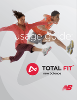
NB Total fit | a brand campaign that reinforced the brand's heritage in performance running and introduced a Total Fit™ philosophy - the dedication to achieving the perfect fit. Total fit captured NB's understanding of running and showcased that FIT was what was NB's core value & brand DNA.
Click on the PDF to see the guidelines we developed to ensure this sub-brand was used and adopted by the many NB employees and vendors globally correctly. | |||||||
|
NB Brand Bible | In 2007 we were asked to write and produce a corporate identity guideline for NB - affectionately known (internally) as the brand bible. The book covered all aspects of corporate communication at that time. It showed how the brand had morphed over time to the brand that we were presenting, We set standards and gave best practice examples for all to follow - in effect we were showing them how to work with the brand & embrace it in order to build campaigns that reflected the new corporate culture and voice. (coincidentally - we were also asked to create the preceeding guide just a year or so earlier).
This PDF is a copy of the 2007 edition. We wrote it, we compiled it, the shoe photography (p20) is our work, the creative examples (p31-35 & p40-41) are our designs, we named and branded several of the technologies (p36 &37). Essentially we were able to leverage our experience and our previous work as assets for the piece. | |||||||
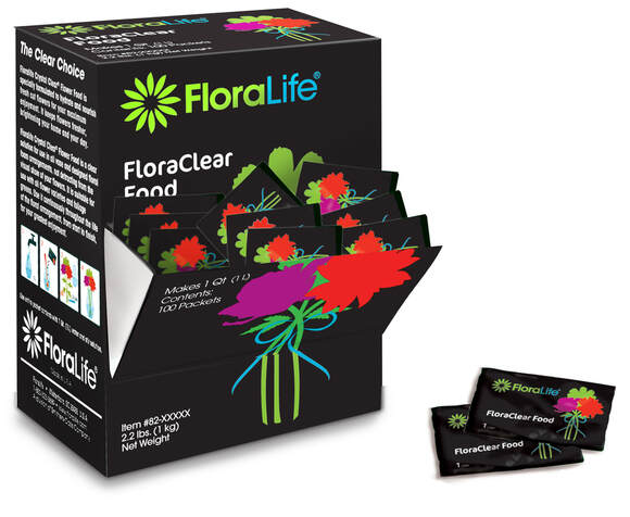
FloraLife | international packaging system
FloraLife is an international chemical company, that focuses on plant & flower growth 7 maitenance. As consumers - we tend to be more familiar with products focused on the final stages to the whole flower growth process. - There's a good chance that the small sachet you're given when you purchase a bouquet is a FloraLife product.
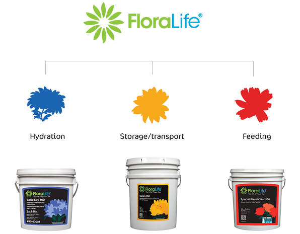
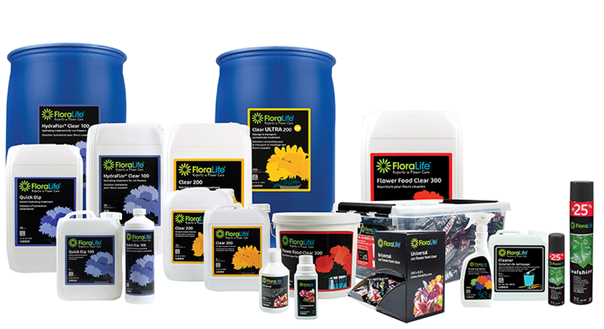
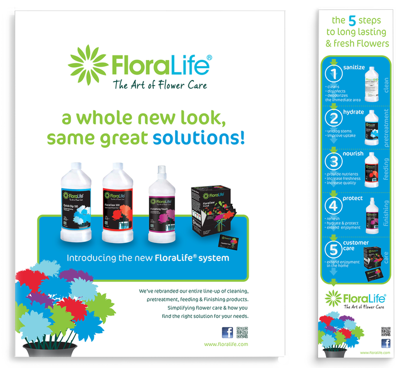
GoBig was asked to rebrand the FloraLife packaging and establish a clear system that organized and 'refreshed' the product line. In a nutshell, the product line was grouped into three distinct growth stages:
GoBig was asked to rebrand the FloraLife packaging and establish a clear system that organized and 'refreshed' the product line. In a nutshell, the product line was grouped into three distinct growth stages:
from sachets of flower food to industrial sized tanks for farmers... It's a system that's both versatile & expandable.
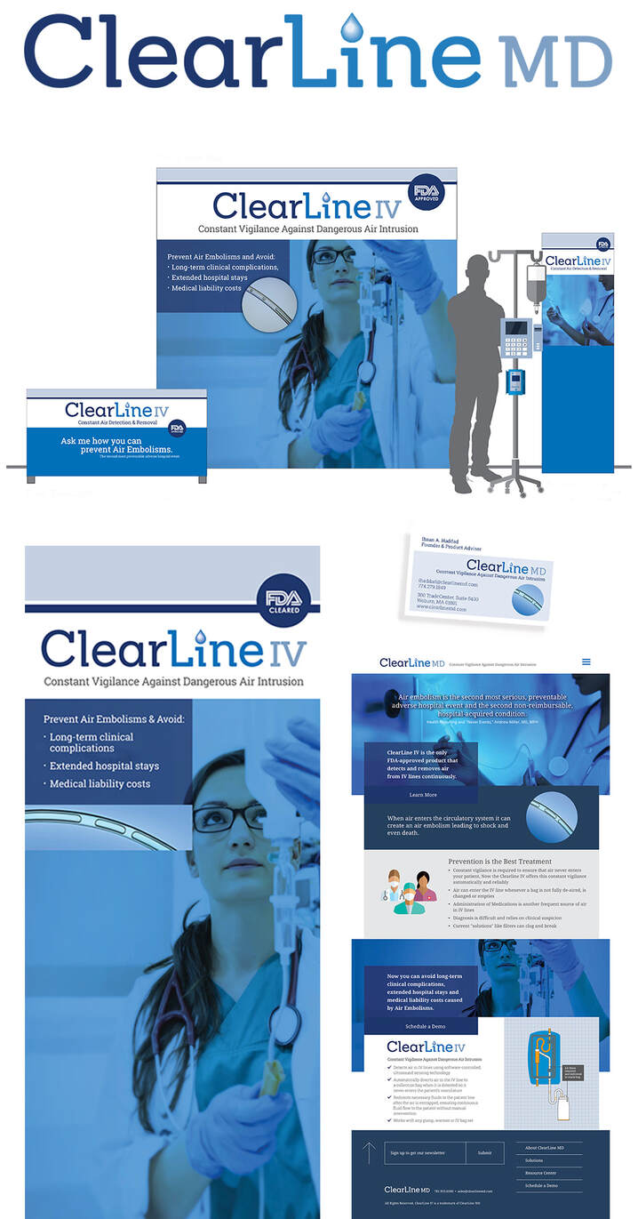
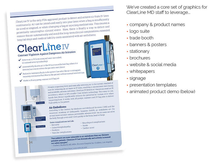
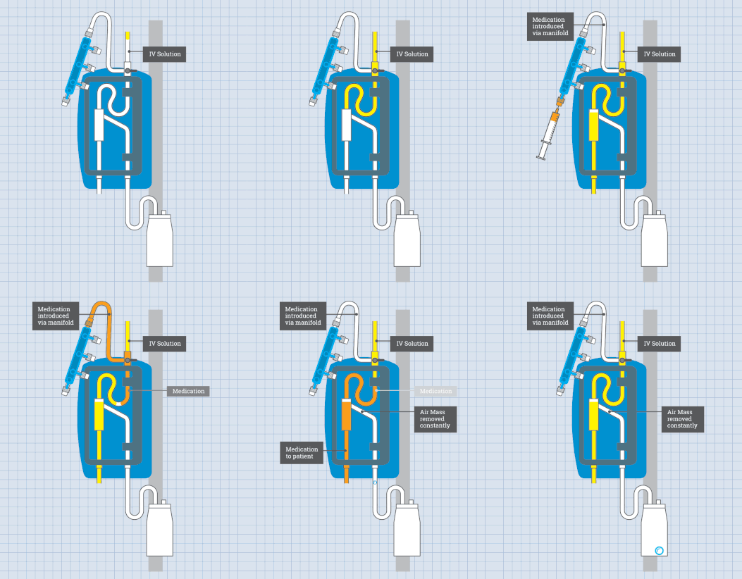
ClearLine MD | naming and brand development
ClearLine MD is another company we've named & branded, helping to immediately establish the
company in a rapidly growing medical device industry. ClearLine IV is the first product to b launched.
company in a rapidly growing medical device industry. ClearLine IV is the first product to b launched.
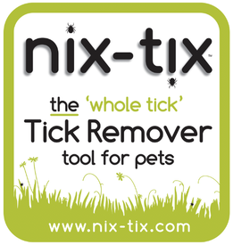
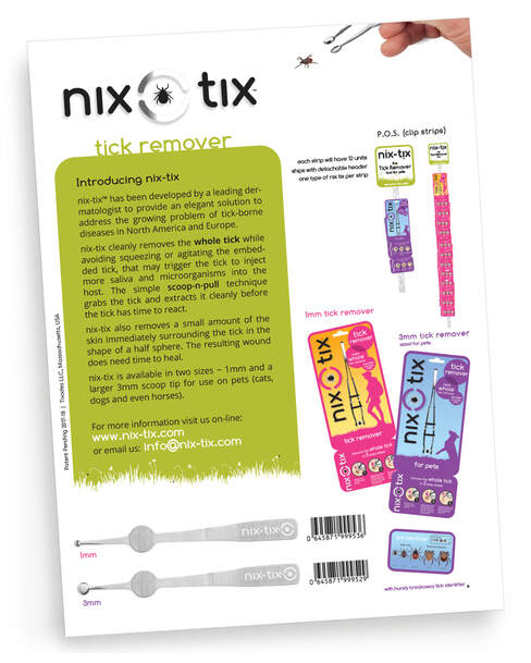
nix-tix | naming and brand development
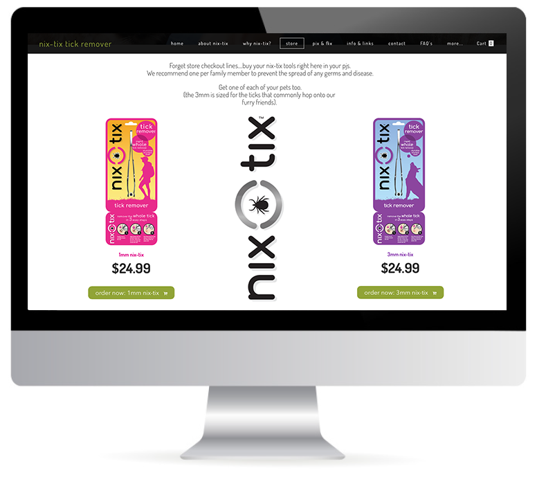
Name/identity/packaging & web presence. This one's is a work in progress!
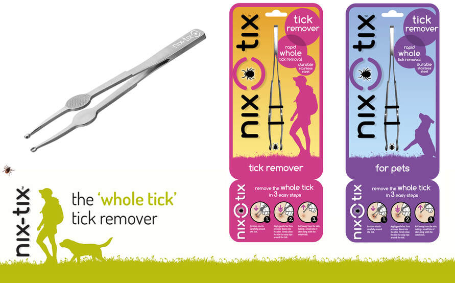
nix-tix is a tick remover with a difference. It removes the entire tick in one action, setting it apart from other tick removers and as a result there's a much better chance of preventing illness in people & pets alike.
The client approached us with a working sample of a medical tweezer for removing ticks. At the time they had been planning on using a different name, but it was a name that just seemed a little too, well... 'medical devicey'. So we suggested that we should develop a name that not only said what the tool did, but was easy to remember & ultimately more consumer friendly.
We came back with nix-tix and it stuck! Within a couple of weeks we had a name, a hero package design, website, the start of a social media presence & a much clearer path for how this amazing tool is going to reach the American & European consumer this year and next.
print advertising:
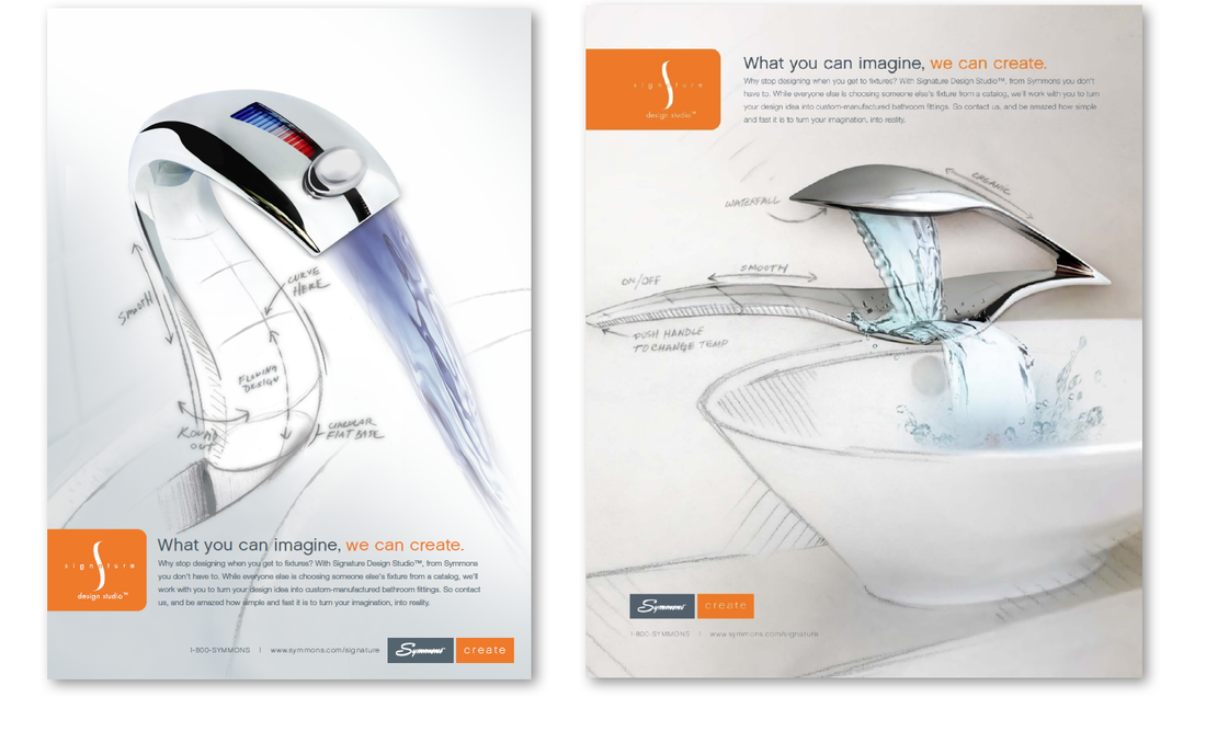
Symmons Create | Full page Ad
Faucets will never be the same again! Symmons challenged customers and competitors alike with a new line of thinking... Symmons Create is a unique product offering that allows the customer to custom create fixtures for the first time.
